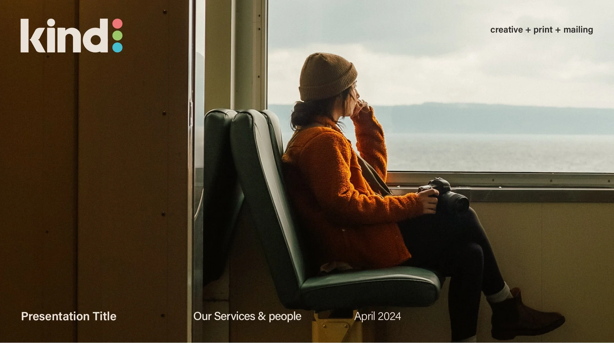
KIND AGENCY
Client: New Health & Fitness studio
Brief: Brand creation, website, print & social collateral
Website: studioninetyfive.uk
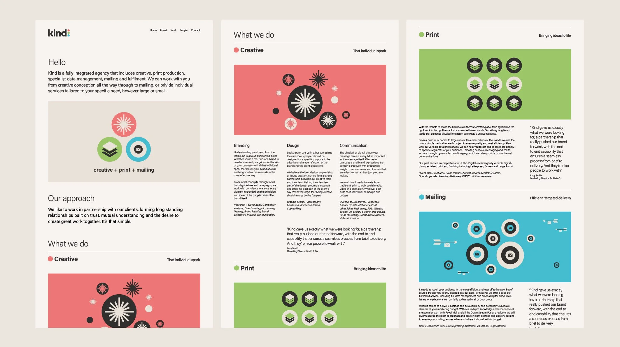
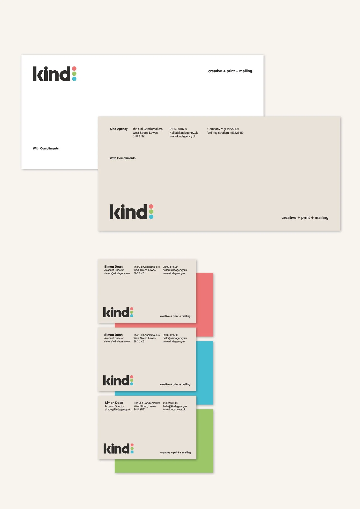
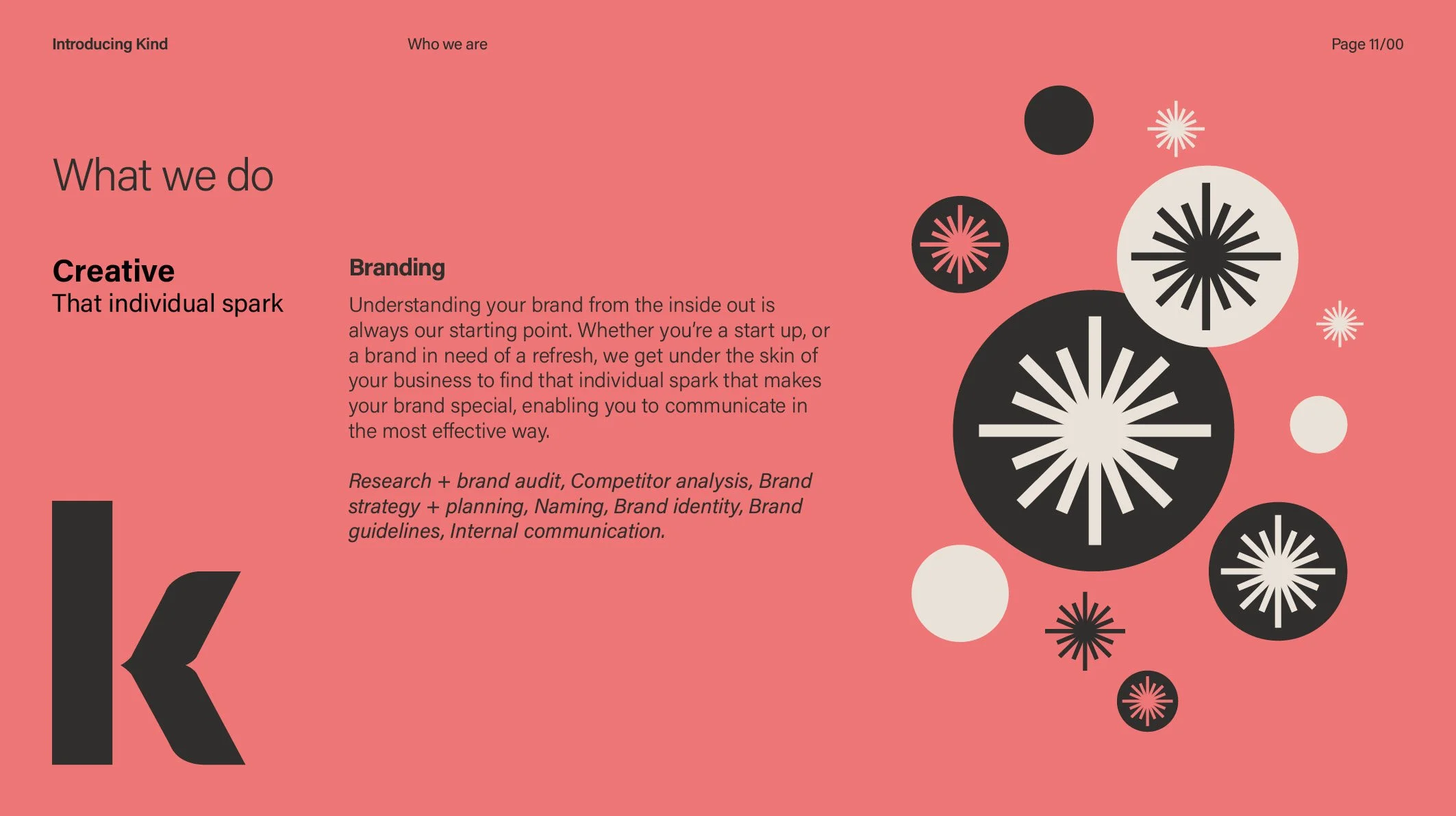
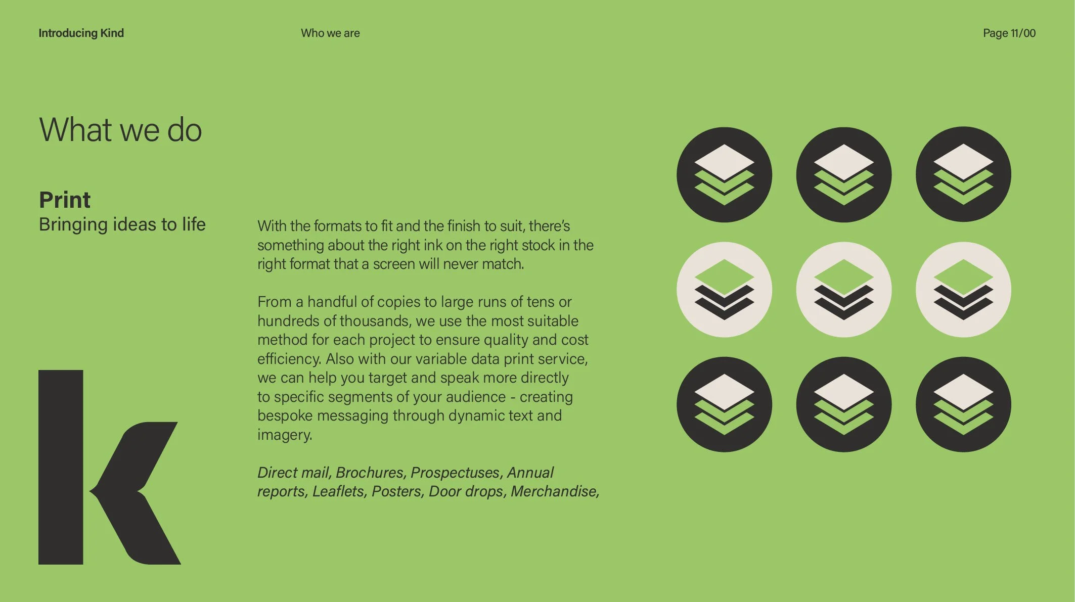
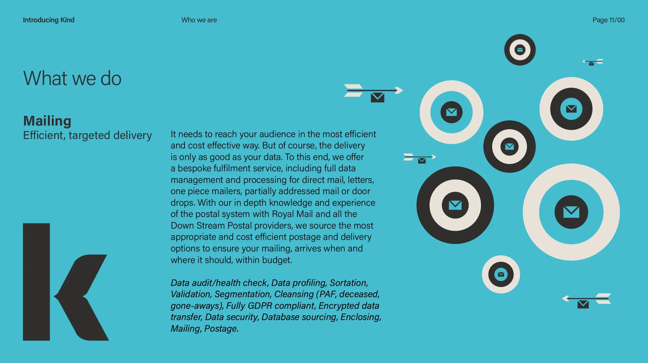
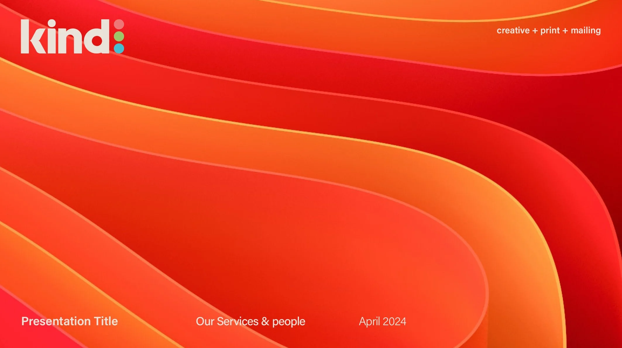
Brand refresh for an agency that combines creative, print and fulfillment under one roof. The refresh looked at not only the nature of the services but also the nature of the people, who give a huge amount of their time and skill to charity organisations.


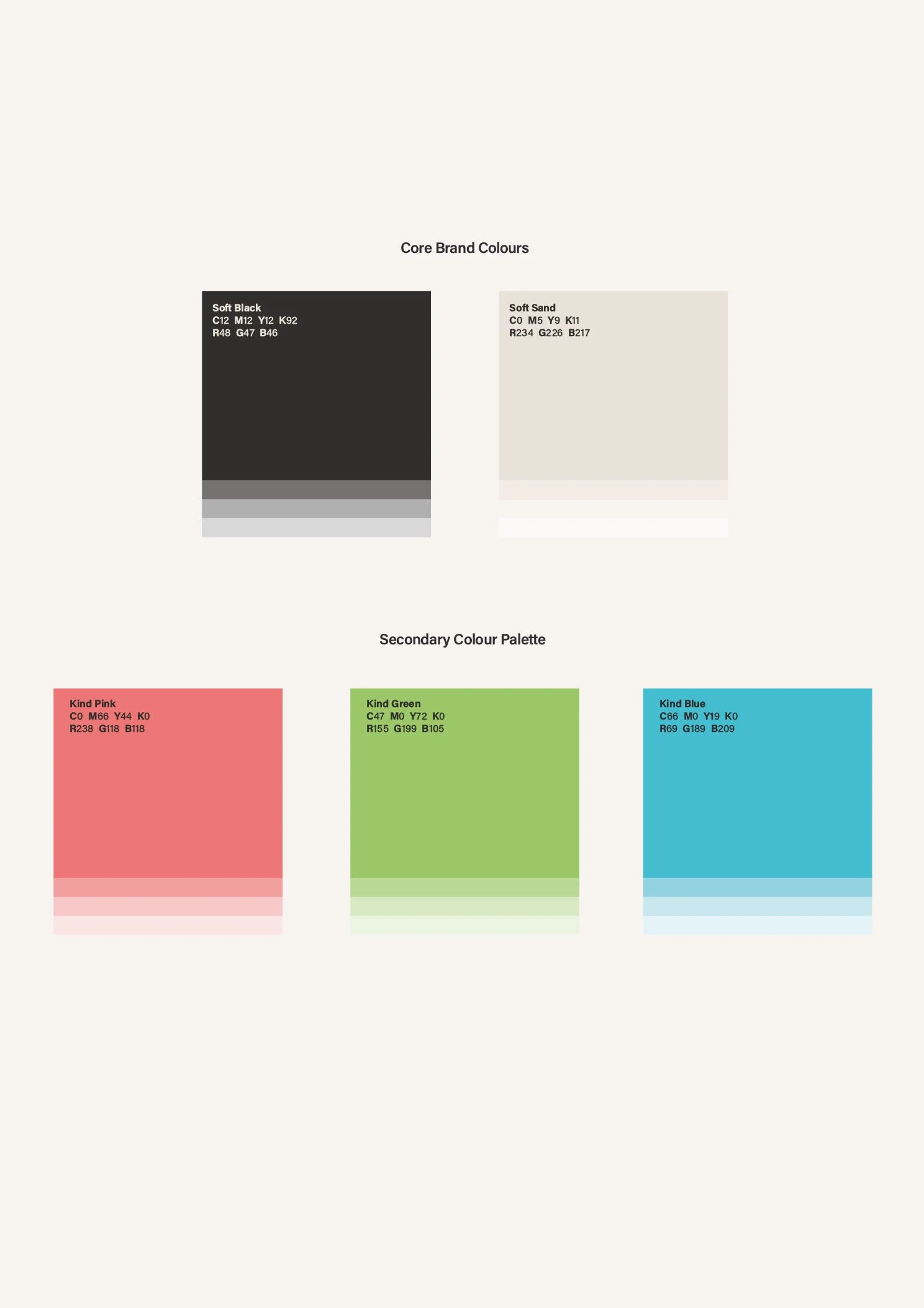
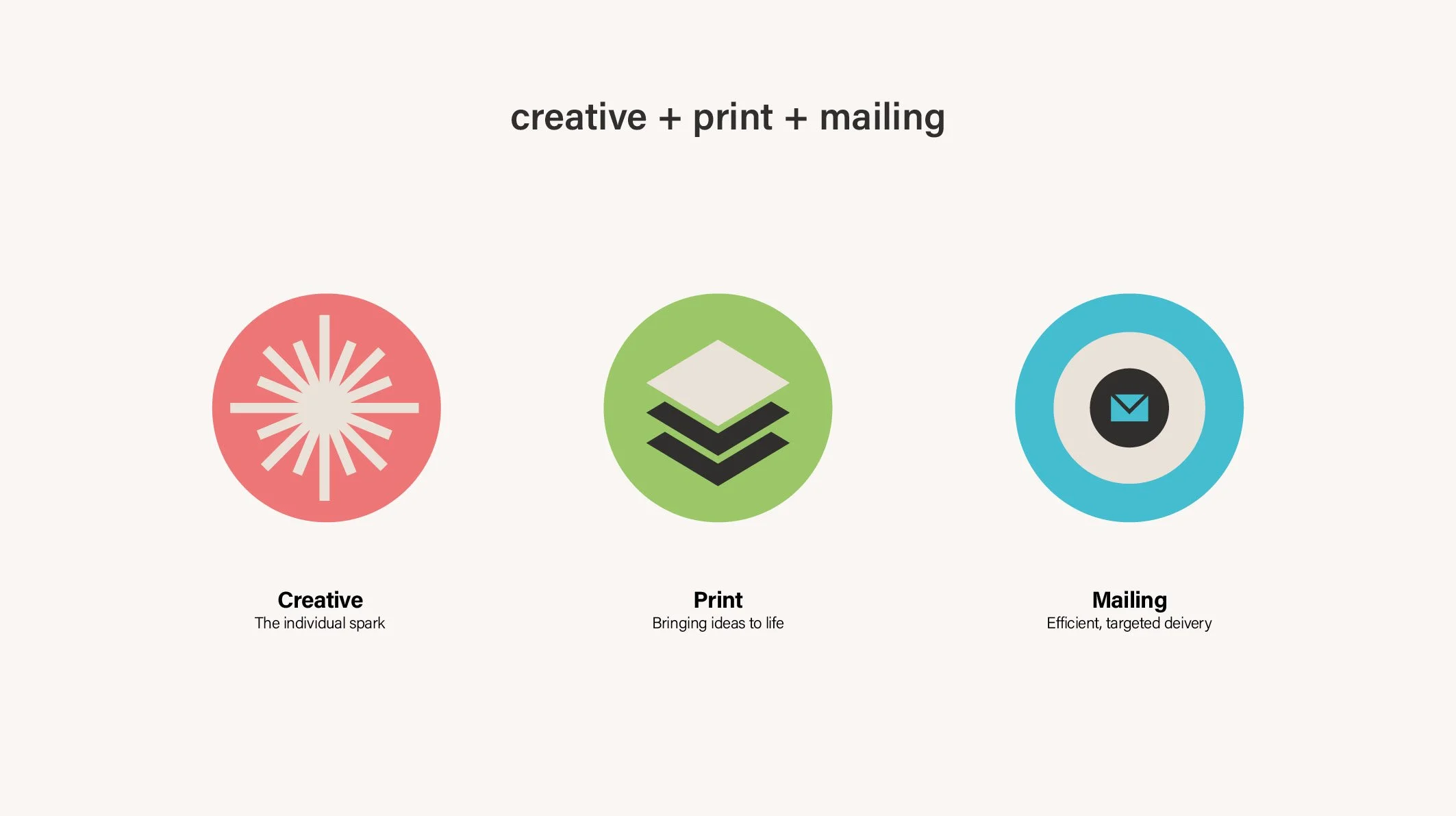
The colour palette combines consistency of the logo colour with the flexibility of the secondary palette when talking about the three specific areas of the business offering.
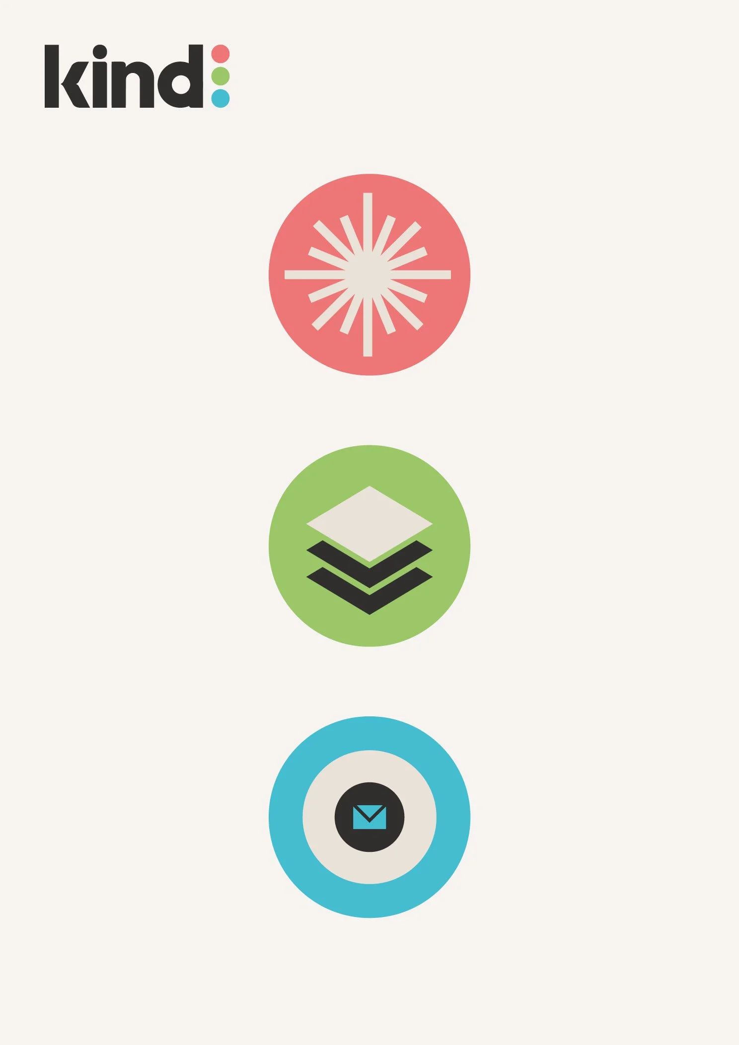
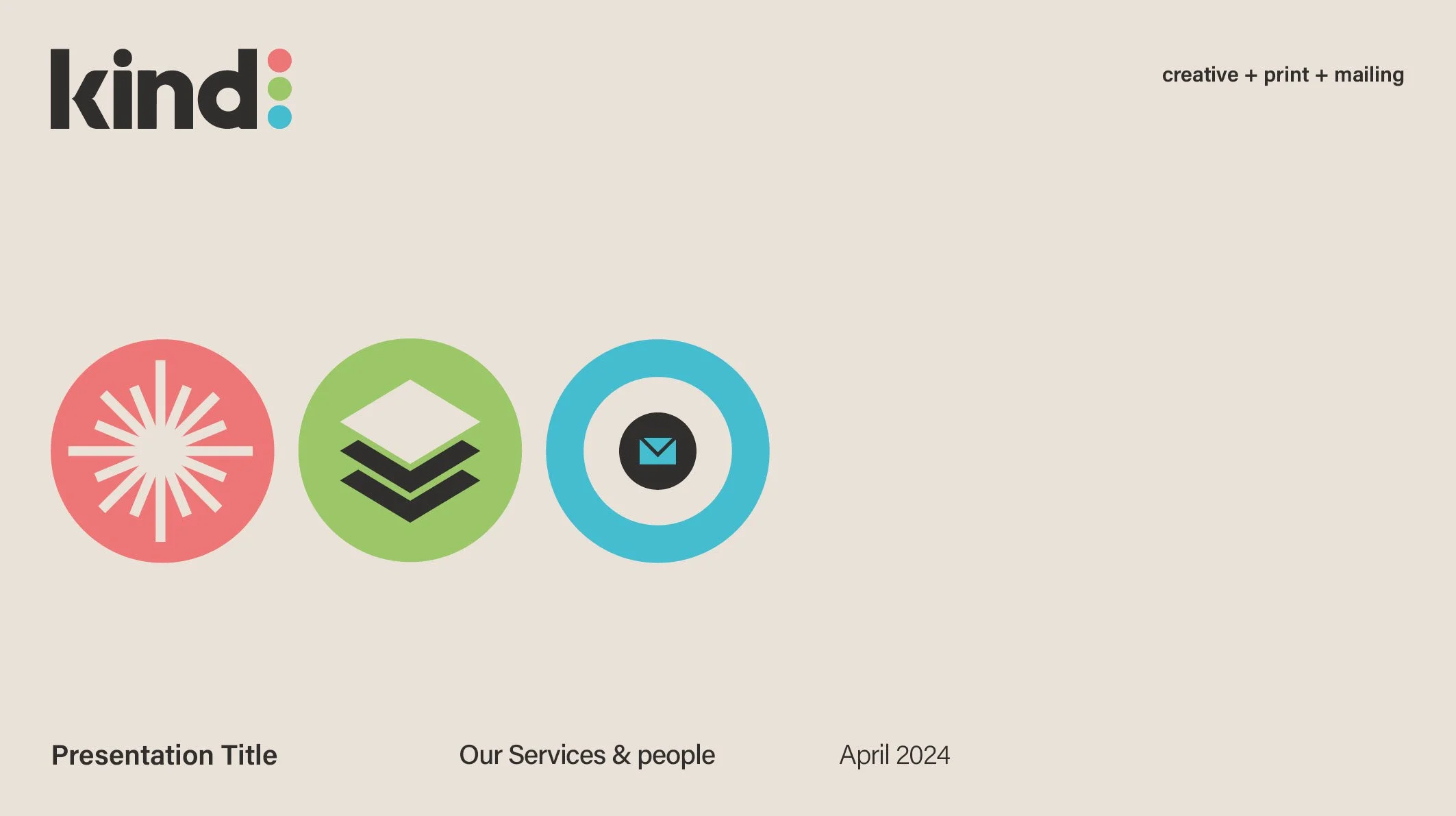
Using the secondary colour palette, three icons were created to signify the three areas of speciality - Creative, Print & Mailing. Some clients will make use of all three services, some only one.
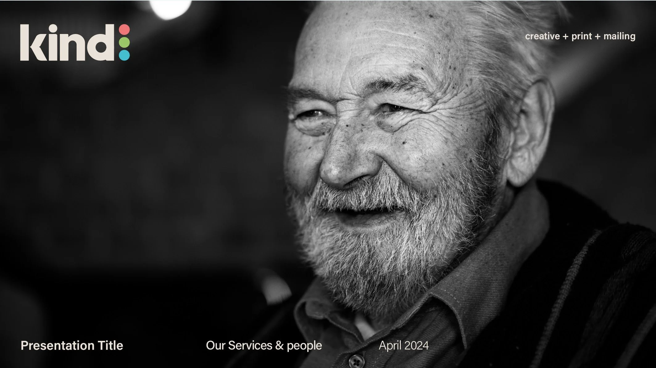
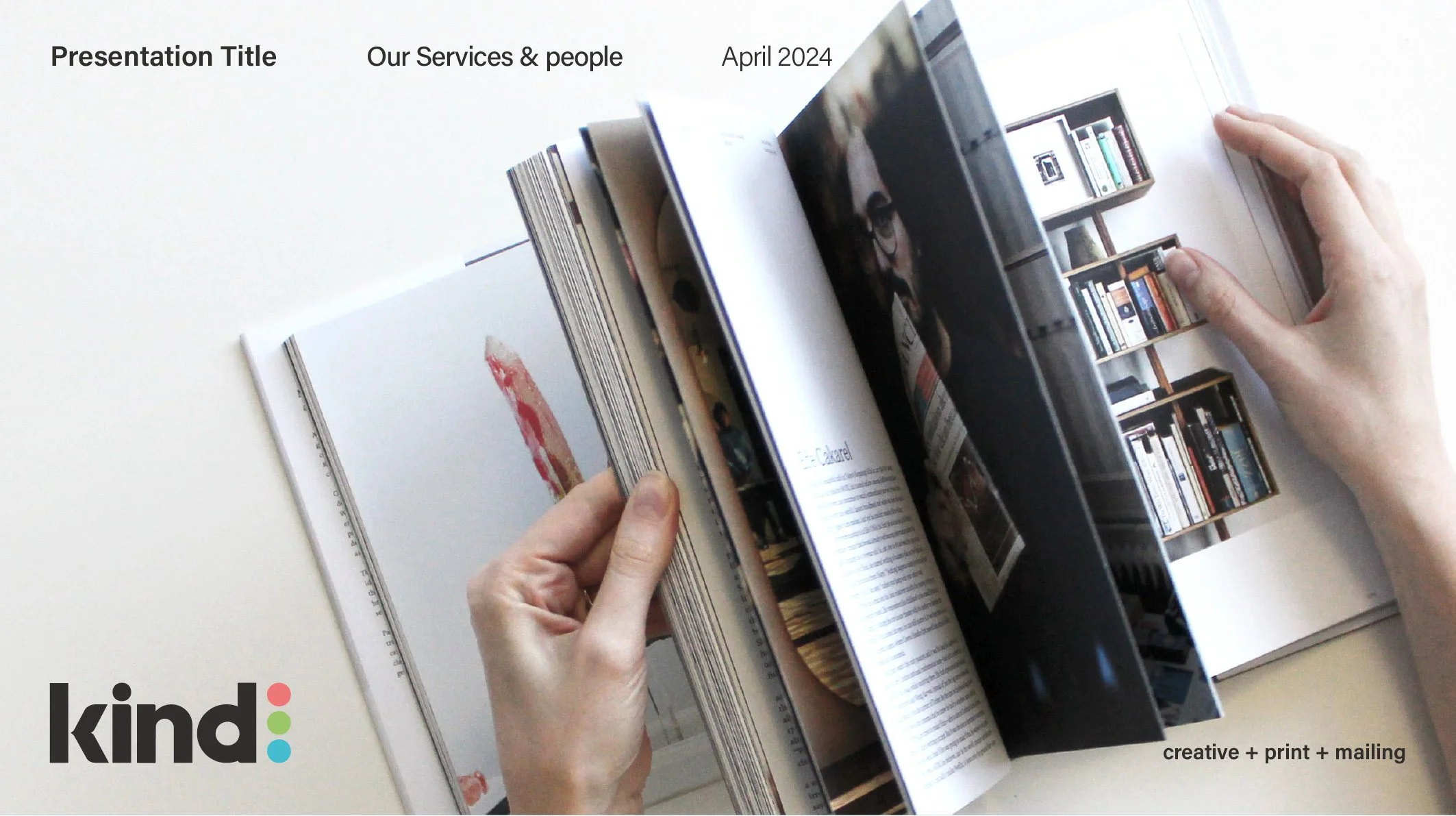
Presentation covers and introduction pages tell the story with a clearly defined visual language and layout. The use of photography for specific clients & projects is useful in bringing the targeted customers to life, especially for charity focused work.
The online presence breaks down the services in greater detail and allows clients to understand how the Kind offering can be tailored to suit different client requirements.