A selection of smaller trading projects for local businesses and start-ups. Small budgets and working one-on-one with a client means the process is efficient and leads to work that very much reflects the client and their business.
Branding edit

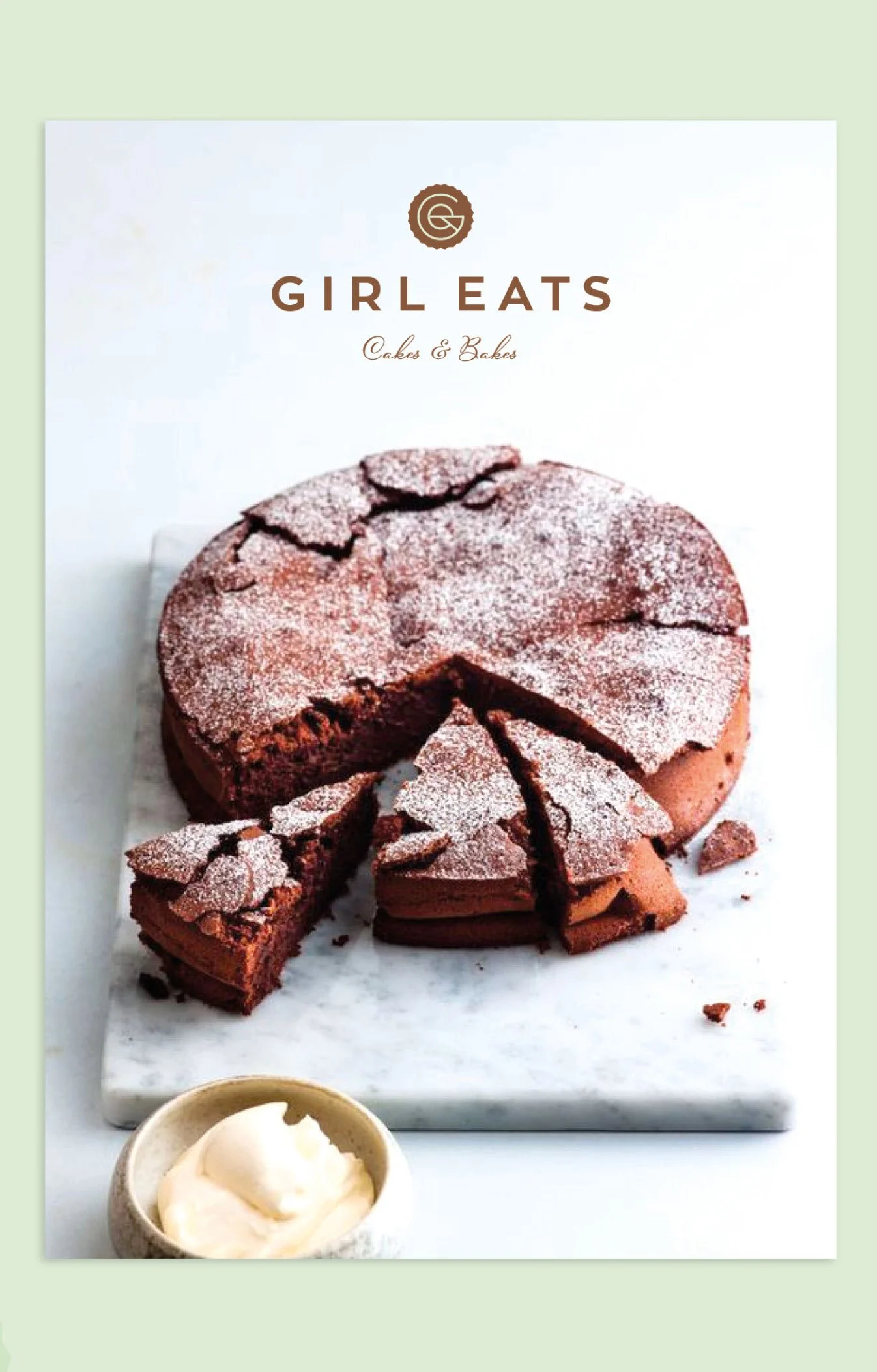
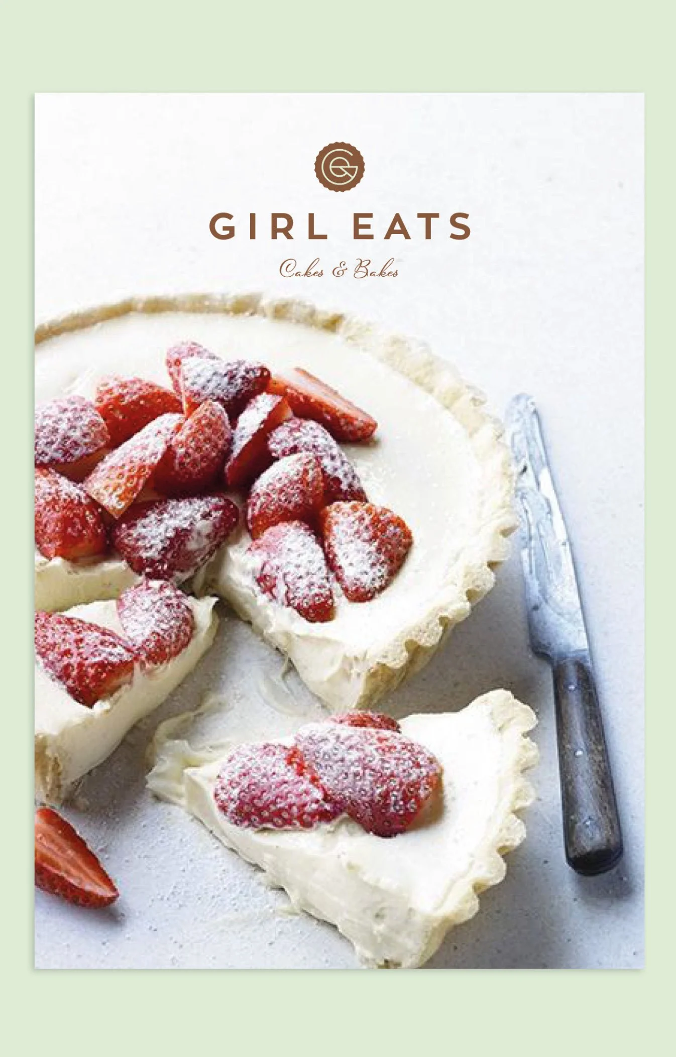
GIRL EATS BAKERY & CAFE
An identity created for a local business that created deliciously crafted cakes of all shapes and flavours. The small cafe and bakery also catered for events and delivered bespoke orders locally. Girl Eats founder Samantha had a natural talent for baking as well as having a very clear vision for her brand.
Client: Local bakery and cafe
Brief: Brand creation, print & social collateral

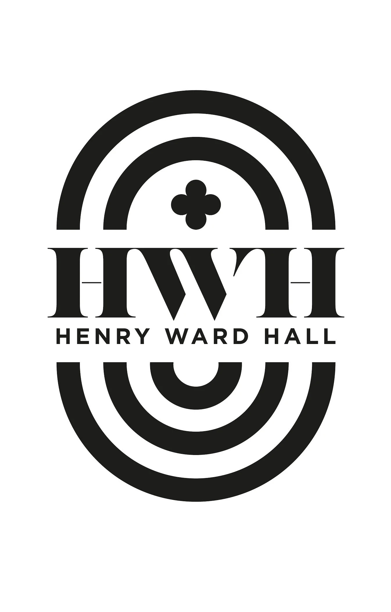
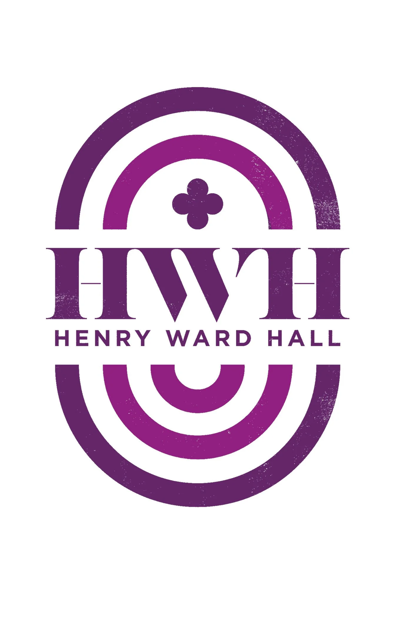
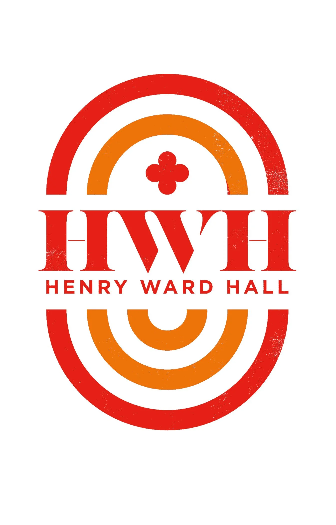
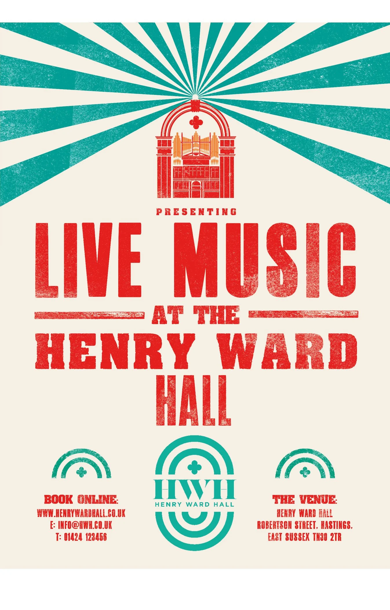
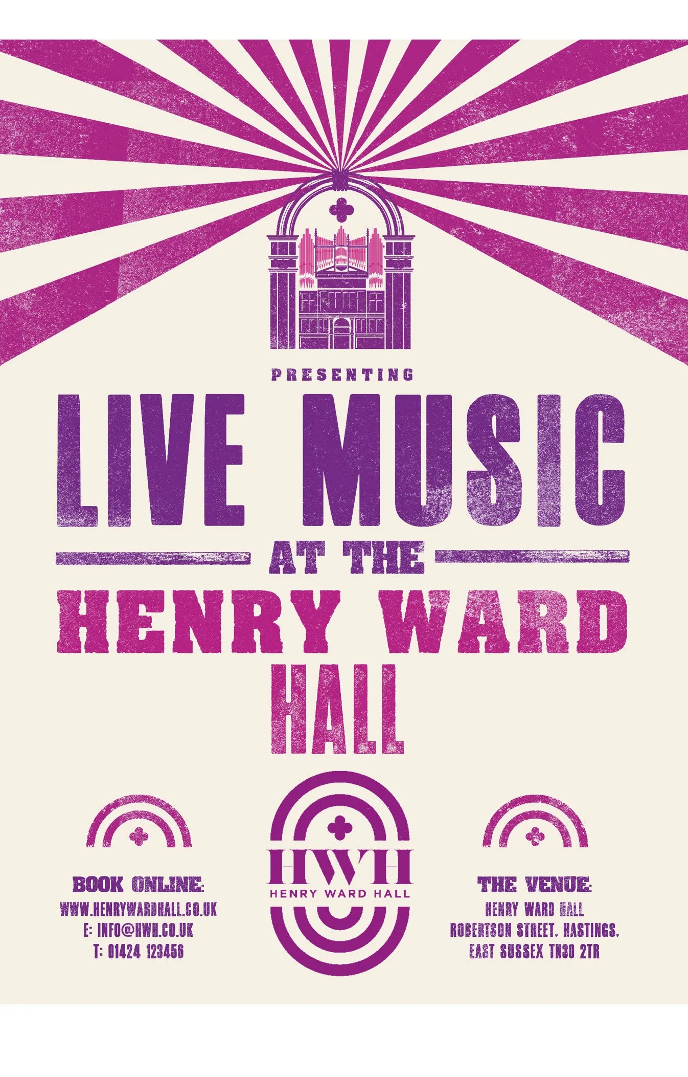
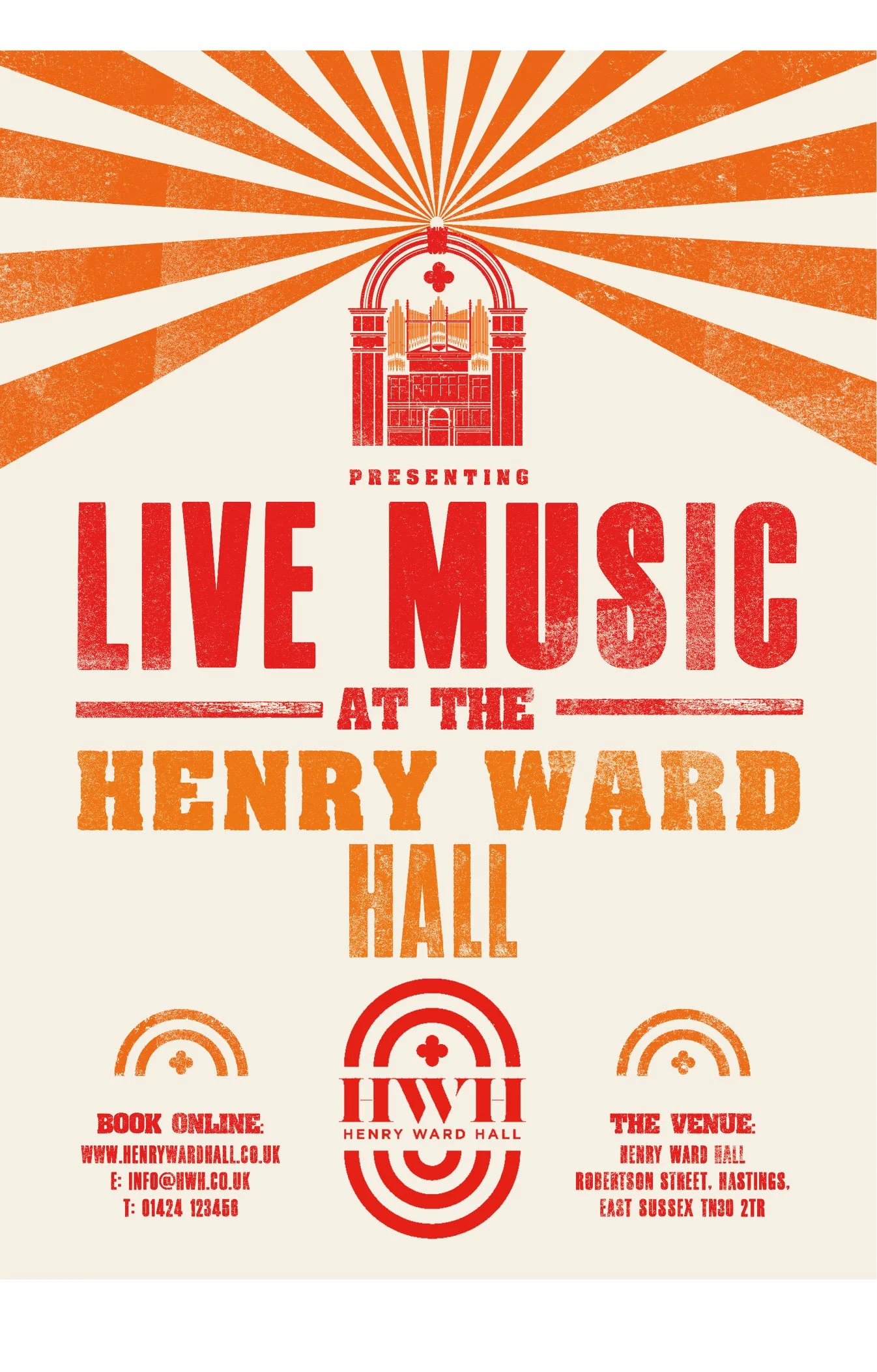
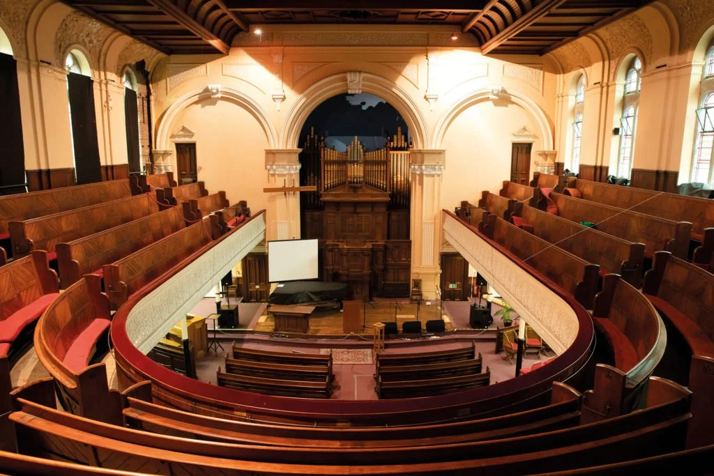
HENRY WARD HALL MUSIC VENUE
A local Hastings church hall repurposed as a venue for live music and community events. The logo reflects the desire to reflect the beautiful and historical interior, with the aim to attract both audiences and acts from around the country to taste the unique acoustics and atmosphere.
Client: Local church converted for live music
Brief: Brand creation, print & social collateral


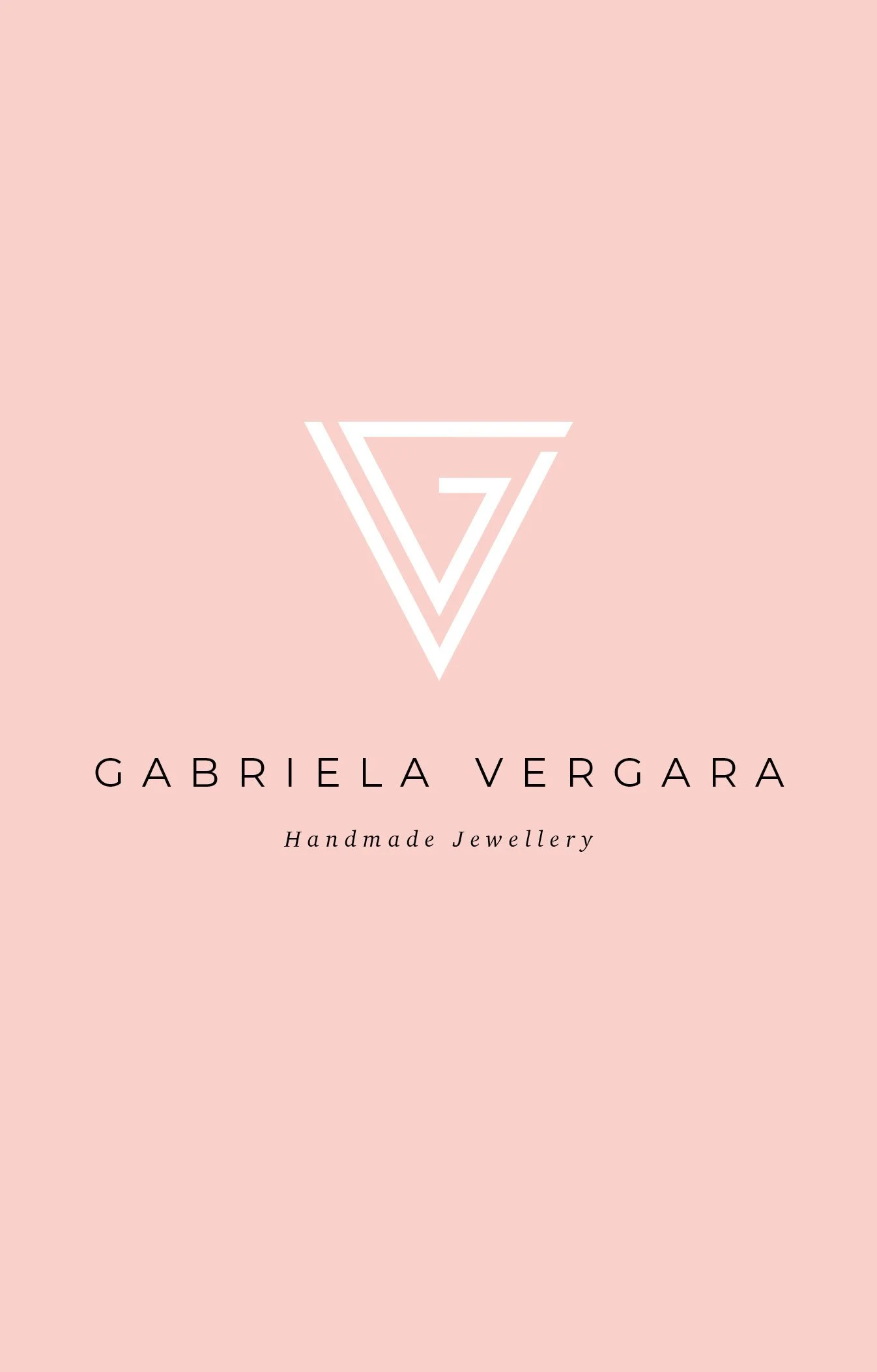
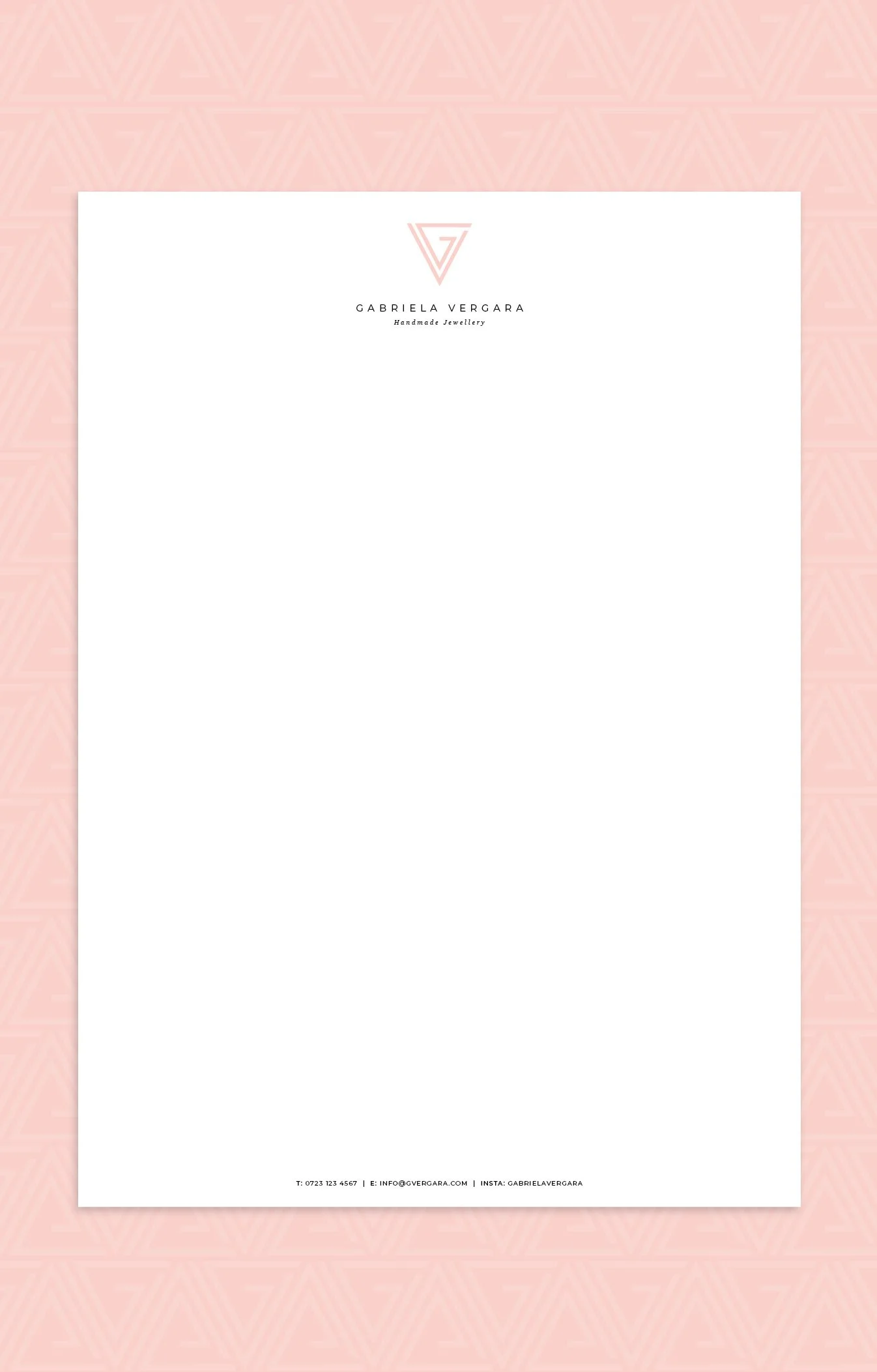
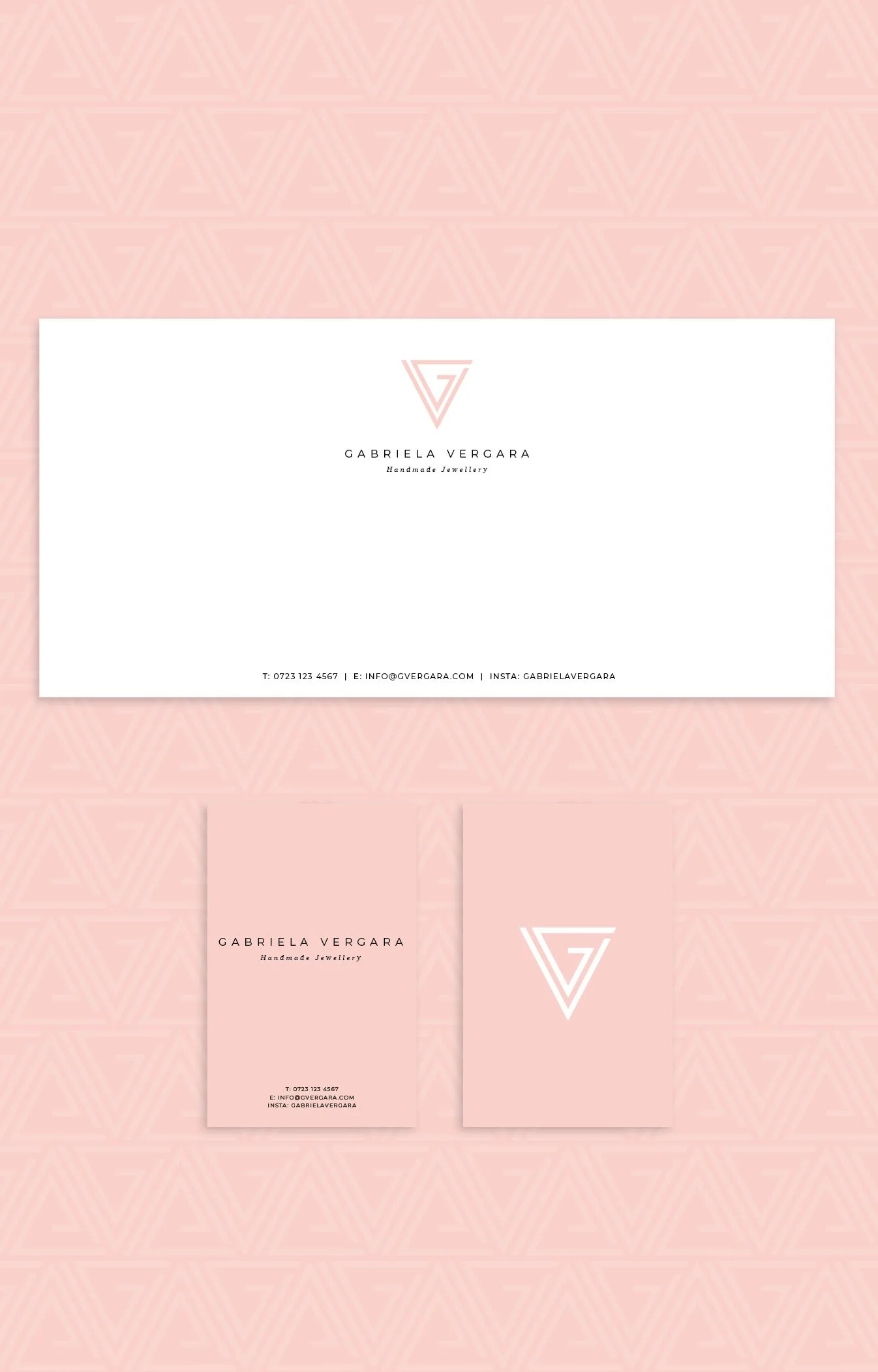
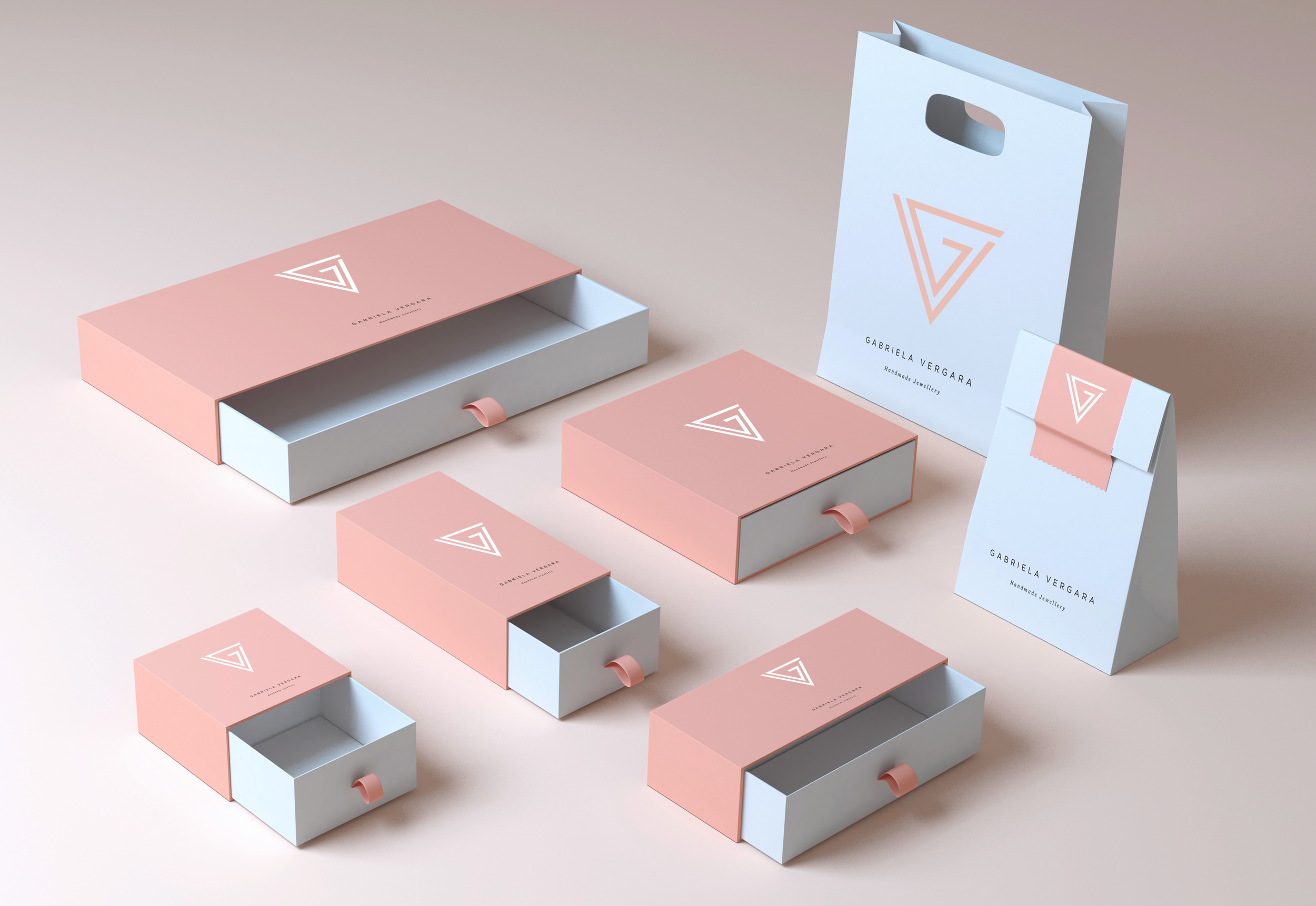
GABRIELA VERGARA
Brand mark and packaging for Gabriela Vergara. Gabriela was looking to launch her jewellery to a more exclusive market after several years of painstakingly building her business based on beautiful handmade pieces - low on quantity and high in quality.
Client: Independent handmade jewellery
Brief: Branding, stationery & packaging


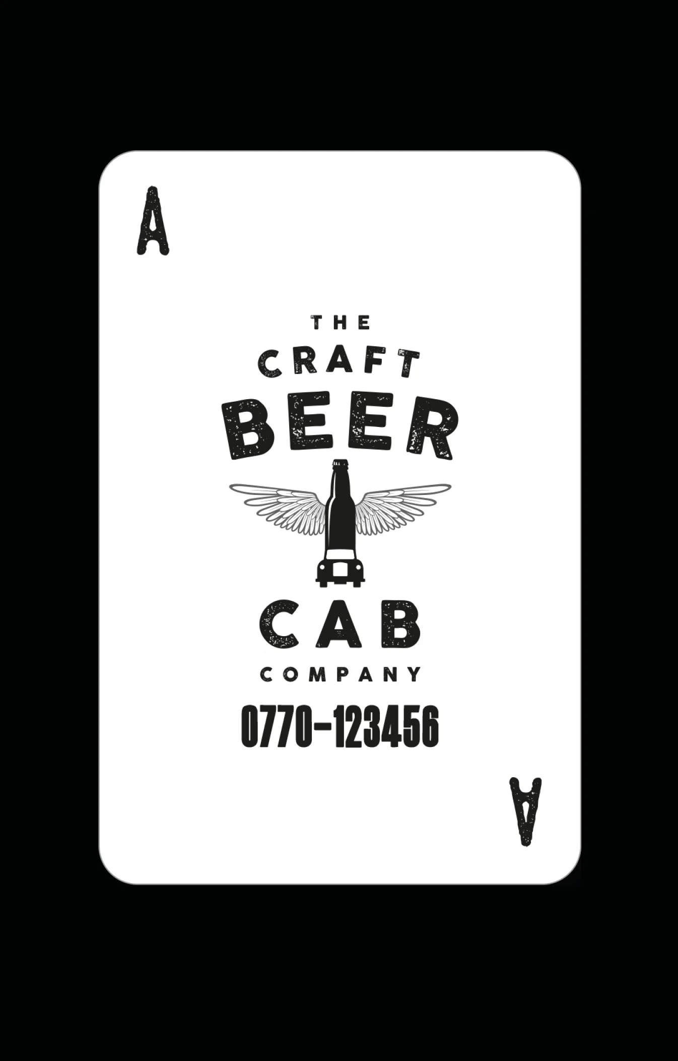
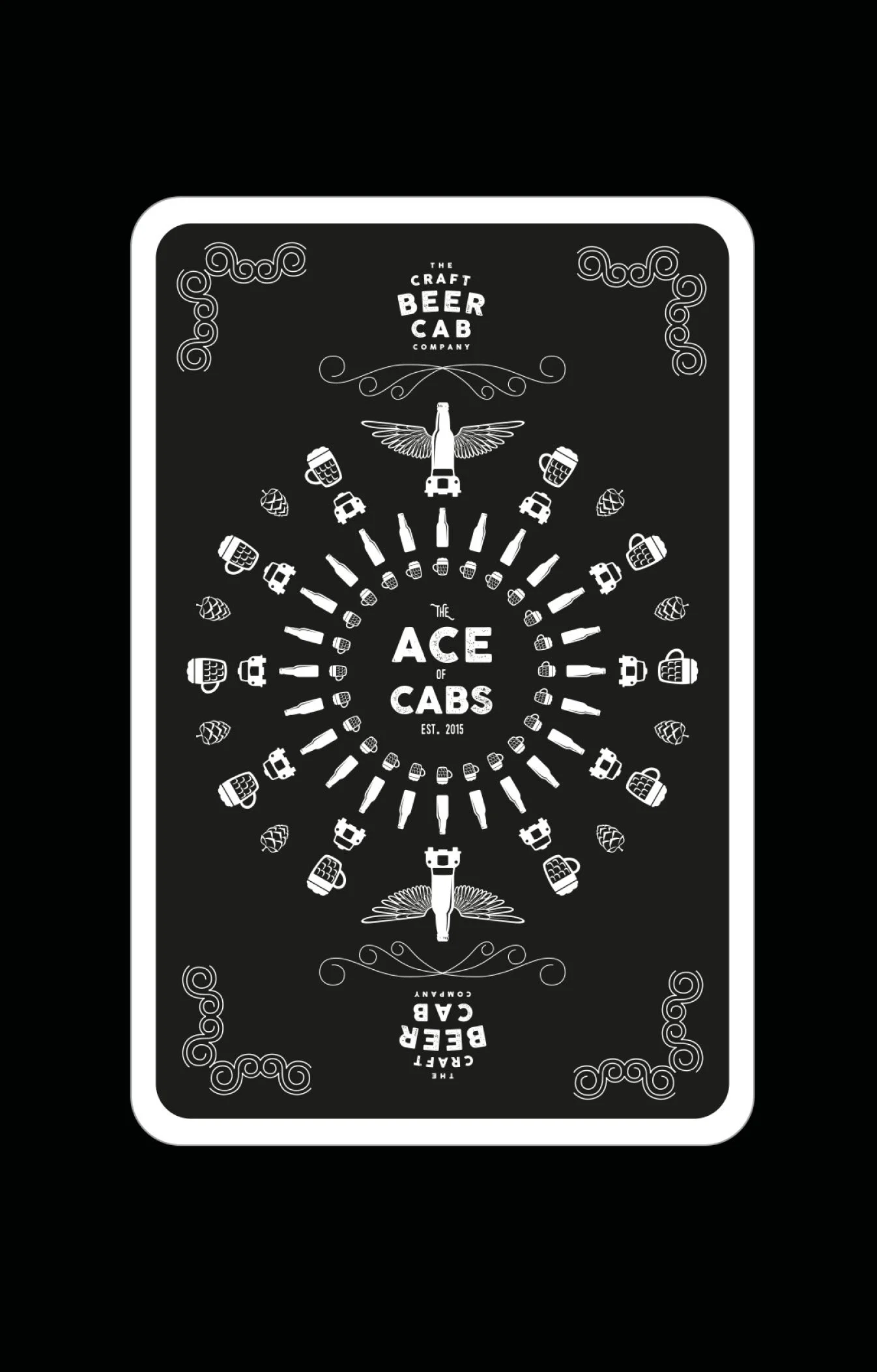
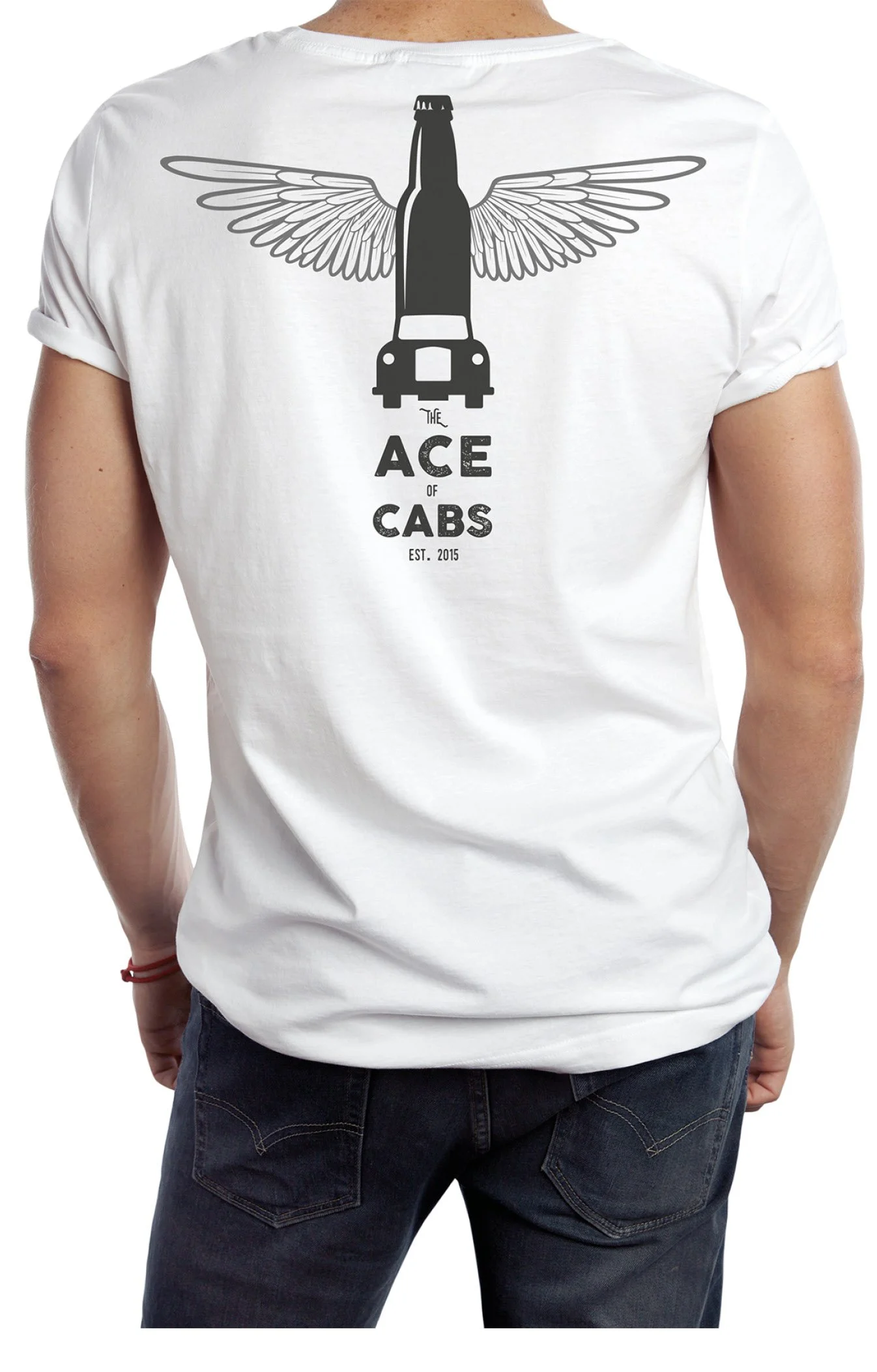
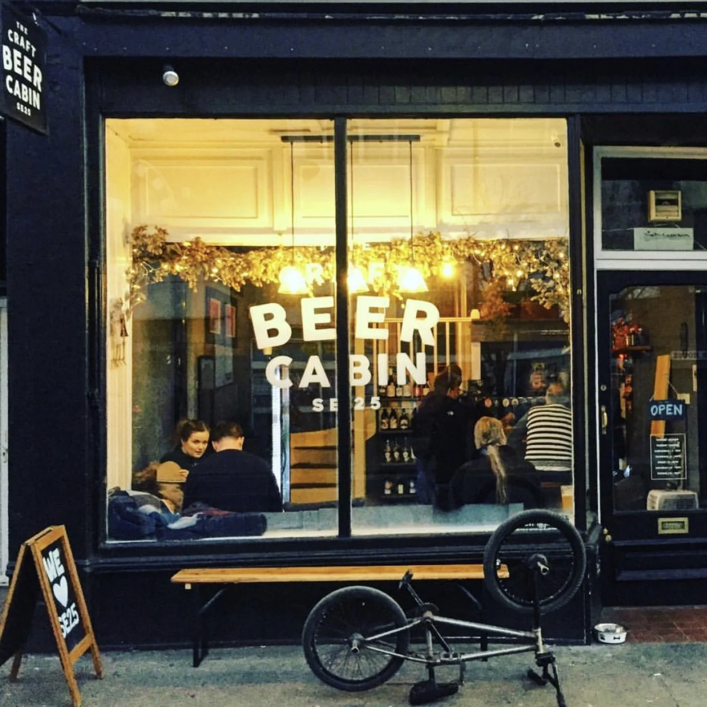
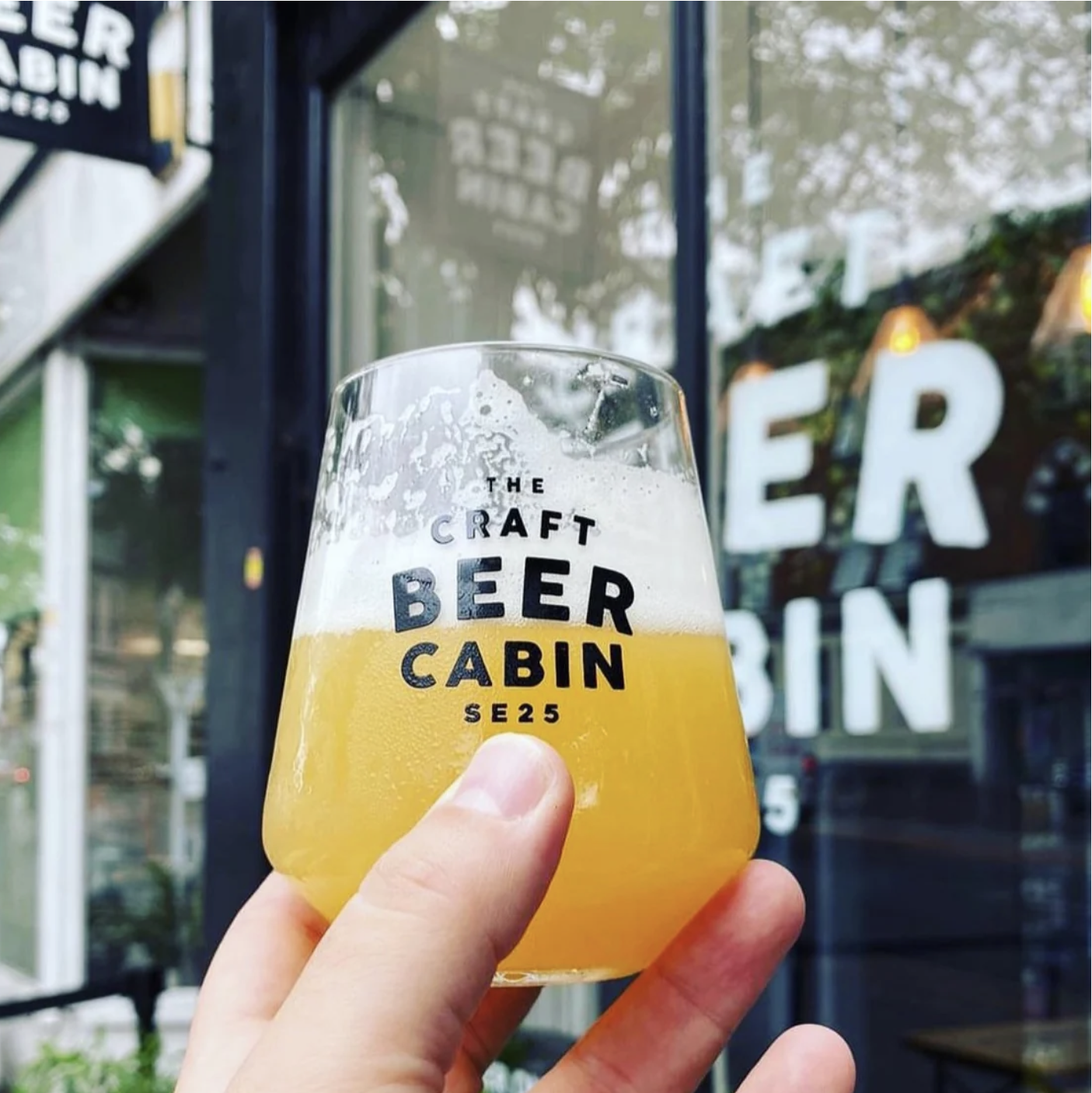
THE CRAFT BEER CAB
This particular start-up began with a chance meeting of two strangers on a South London street while flagging down a London cab. One had the brewing experience, the other a marketing head, and so began a very successful business (and marriage). The business grew from taking locally brewed craft beer out to events in an old cab to successfully opening two craft beer bars.
Client: Independent Craft Beer in a London cab & cabin
Brief: Branding, stationery & packaging